http://scotteablog4.blogspot.com/
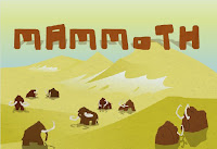
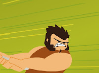
The style used in this animation is very flat based and looks alot like some of the older nickelodeon cartoons.
There has been a lot of thinking into the details that needed to be included in this project to make it really effective. For example there is a lot of sound files which really help to improve the feeling of the cartoon by backing up characters movements. Another aspect that I thought was effective was the different way some frames were displayed. Some of the more faster scenes where shown with the characters involved and streaked blurring of the background. Even though the graphics are only 2D this really helped to show the viewer different speeds.

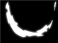
Other scenes I thought were effective was when the small alien was slashing all the mamoths. all you could see was the actual "slash" through a black scene. The "slash" was more or less what you would expect on a very shiny smooth surface, whiped under rays of light.

The imagry in this was amazing and the story line was very clever. The only thing I would change is add a "play again" button at the end.
http://midnightheist.deviantart.com/art/Mammoth-animation-143201983
No comments:
Post a Comment